We’re working on a major renovation for a lovely character home at the moment. The Clients’ taste is very contemporary/modern but because of the age of the home, the City of Vancouver is requesting that they maintain the historical features of the facade. This left the home owners a little unsure as to how to marry those two design styles.
So guess what they did? Asked for help. Brilliant! This is a perfect example of when an interior design professional can help with a project; when you need to balance the function of the space with the aesthetics.
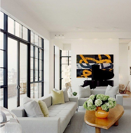
One of the very first things we discussed were windows. Windows and doors are the one element that equally impact the exterior and interior of a building. If this was going to be a traditional home on the outside and a contemporary home on the inside, we had to address this shared element first. Since I never shy away from making a statement, I thought that if we were going to have traditional style windows then lets make them stand out! Traditional windows … in black.
via Bijou and Boheme
via houzz
via The Design Files
These are all contemporary spaces but the style and finish of the windows adds a historic element. The black draws your eye right to them, especially when they’re in contrast with a bright white space, which instantly makes them a feature. This can also be applied to commercial interiors; adding an industrial element to a modern office or retail environment. Since most business are tenants of existing spaces, changes to the facade of their building is not an option, especially for those who don’t occupy a store-front location. For these cases, why not use that black framing as an interior element; to define a meeting room, partition a corridor, create ceiling panels … anything!
via Office Snapshots
via Office Snapshots
Now, hold on to your horses ’cause we’re not stopping there. Why not take this idea a step further and go for coloured windows. Here are a few great examples. I especially love how a traditional exterior gets a modern edge when their classic windows are done in a bright colour.
via SF Girl By Bay
via SF Girl By Bay
This application isn’t right for every space, and certainly isn’t what we’re recommending for this particular client, but it’s a good reminder to consider your options when it comes to those architectural elements that are typically thought of as ‘standard’. Never underestimate the impact that a small change (even just colour!) can make to an every day object.


