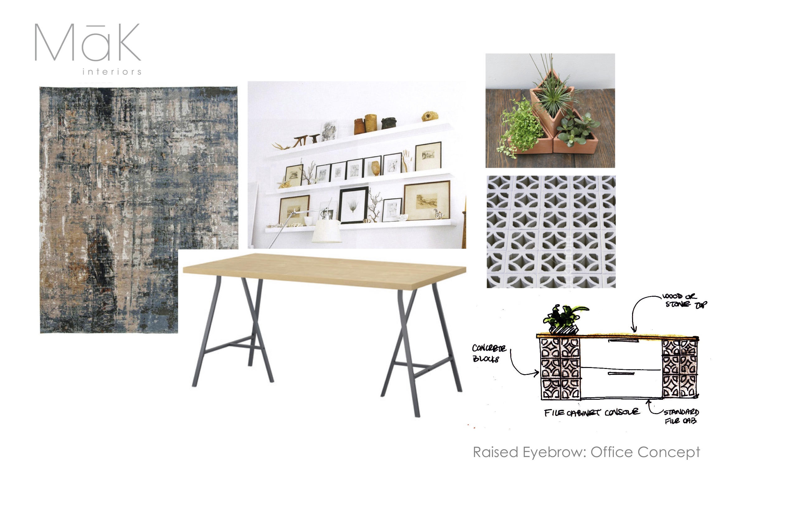
A few weeks ago I had the pleasure of taking part in the IDIBC Student Event which offers Interior Design Students around the lower mainland the chance to have their complete or in-development portfolios reviewed and critiqued by Registered Interior Designers. This is the second year that I’ve been part of the RID group to look over the student work and it is such a great time! First of all, these students are very poised and professional when presenting their projects (+ 10 points), then they take constructive criticism with grace (+ another 10 points), and some of them even follow up with a personal email thanking me for my input (+ 100 bonus point and 2 gold stars … that’ll get you a job my friends!).
The one piece of advice that I gave consistently to the six students I met with this year (as well as the six from last year) is this: show your design process. When I look through a portfolio I don’t want to just see your impeccable final-draft renderings, I want to see how you got there. Show me the sketches, show me the problem solving!
… and then it hit me. I don’t do this in my own portfolio (ie: my website). And in that moment the old adage became true; ‘the teacher becomes the student’ … or something like that. So in the spirit of practicing what I preach, I present to you a new blog column; Showing The Design Process. Here I’ll be showing you some of my sketches, inspiration boards, and other conceptual tidbits that help me get to the final design for my own projects. Let’s kick things off with my design for the office of Raised Eyebrow Web Studio (you can see the finished result here). Enjoy!


