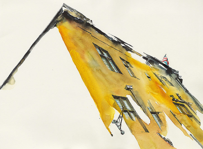
I am always blown away by the talent of those designers and artists who can capture the essence of a space or building with the simplest of pen strokes. Sketching and rendering is one of my favourite parts of being an Interior Designer but I have a habit of going way overboard on the literal details which takes away from the final product. Less is more after all, so knowing what to leave out of a sketch is a true skill. Park Sunga, an illustrator and graphic designer who’s work I found via This is Colossal (a must-see blog for … well, colossal art projects) has truly mastered this approach.


Doesn’t she just make this look so easy?! When you break this images down they are just so simple…which is what makes them so striking. She’s left as much as possible to the imagination and yet given so much detail. Pfff … I wish! This work has definitely inspired me to venture into the world of water colours just for fun. If any of you have any suggestions for art classes I am all ears (leave your recommendations in the comments section).